
I led the design of a 0→1 AI product that helps students plan their academic future.
Handed Off
Dec 2025
Industry
EdTech / Higher Education
Role
Lead Product Designer
Team
8 Student Designers, Salesforce Experience Design Team
TL;DR
Galileo is a 0→1 concept product built in collaboration with the Salesforce Experience Design team as part of a semester-long design studio at IUB. This project explored how AI could support academic course selection for undeclared undergraduates.
I co-led design end-to-end, leading the Overview and Academic Trajectory sections specifically. My work centered on interaction design, information architecture, visual language and AI interaction patterns, specifically how to make recommendations feel actionable. The rest of my work happened between sections, keeping the design consistent when different people were building in parallel.
Information overload with no way to connect the threads
Undeclared students piece together their academic picture from degree audits, enrollment portals, course catalogs and peer advice. None of these systems talk to each other and the result is a lot of information that doesn't add up to anything useful when you're trying to figure out what you actually want.
Talking to the students surfaced four consistent patterns:
01
Decisions made early compound over time
Early course choices shape workload balance and eligibility for majors down the line. These decisions can have long-term consequences.
02
Data exists but interpretation doesn't
University tools surface requirements but don't help students understand what any of it means for their specific path.
03
Academic systems are fragmented by design
Students piece together their academic picture from degree audits, course catalogs, enrollment portals and peer advice, none of which talk to each other.
04
Decision fatigue erodes away confidence
Scattered information forces students to synthesize academic data manually, increasing cognitive load and reducing confidence in their choices.
One system, four lenses and an AI that informs without deciding.
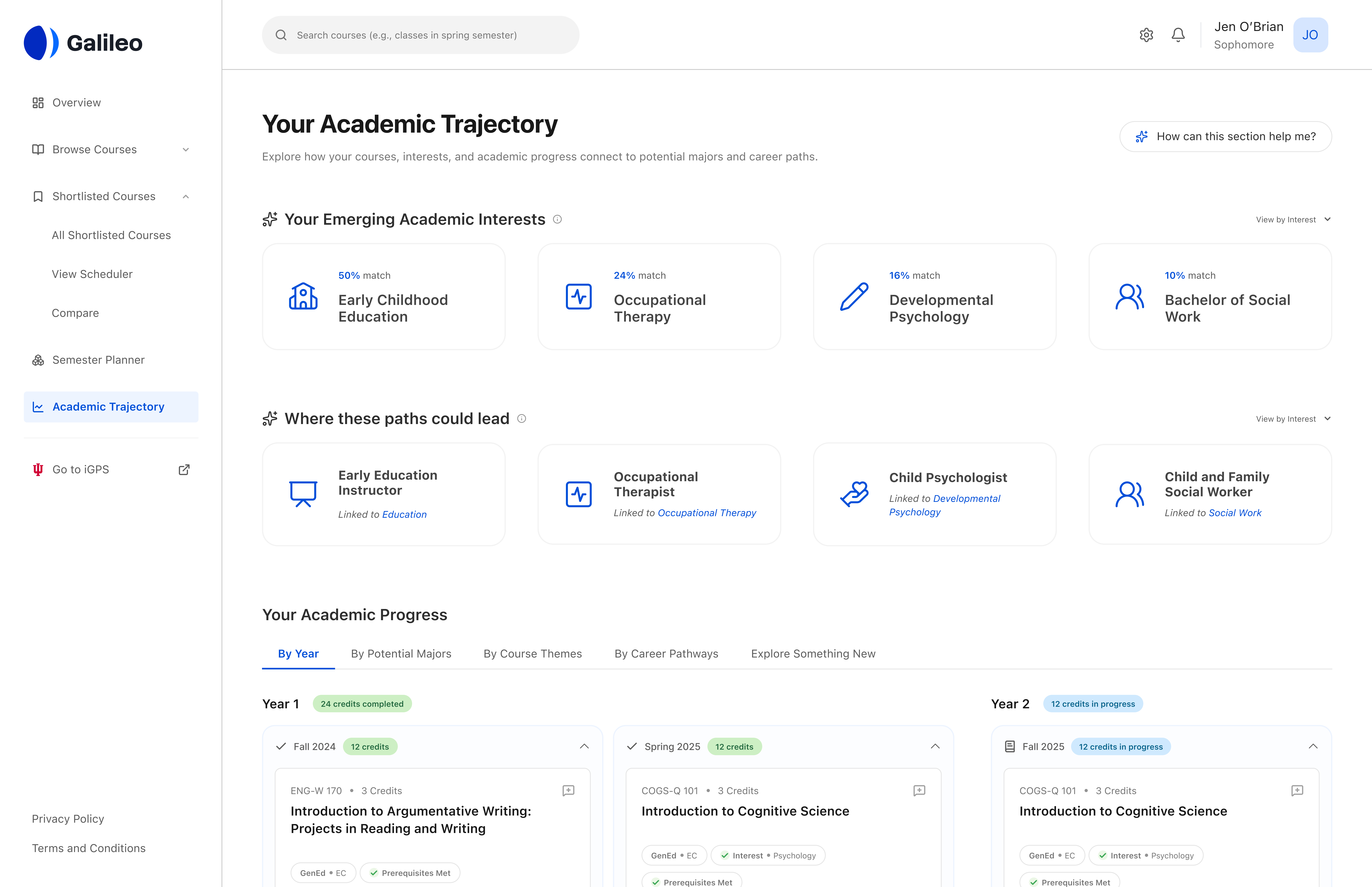
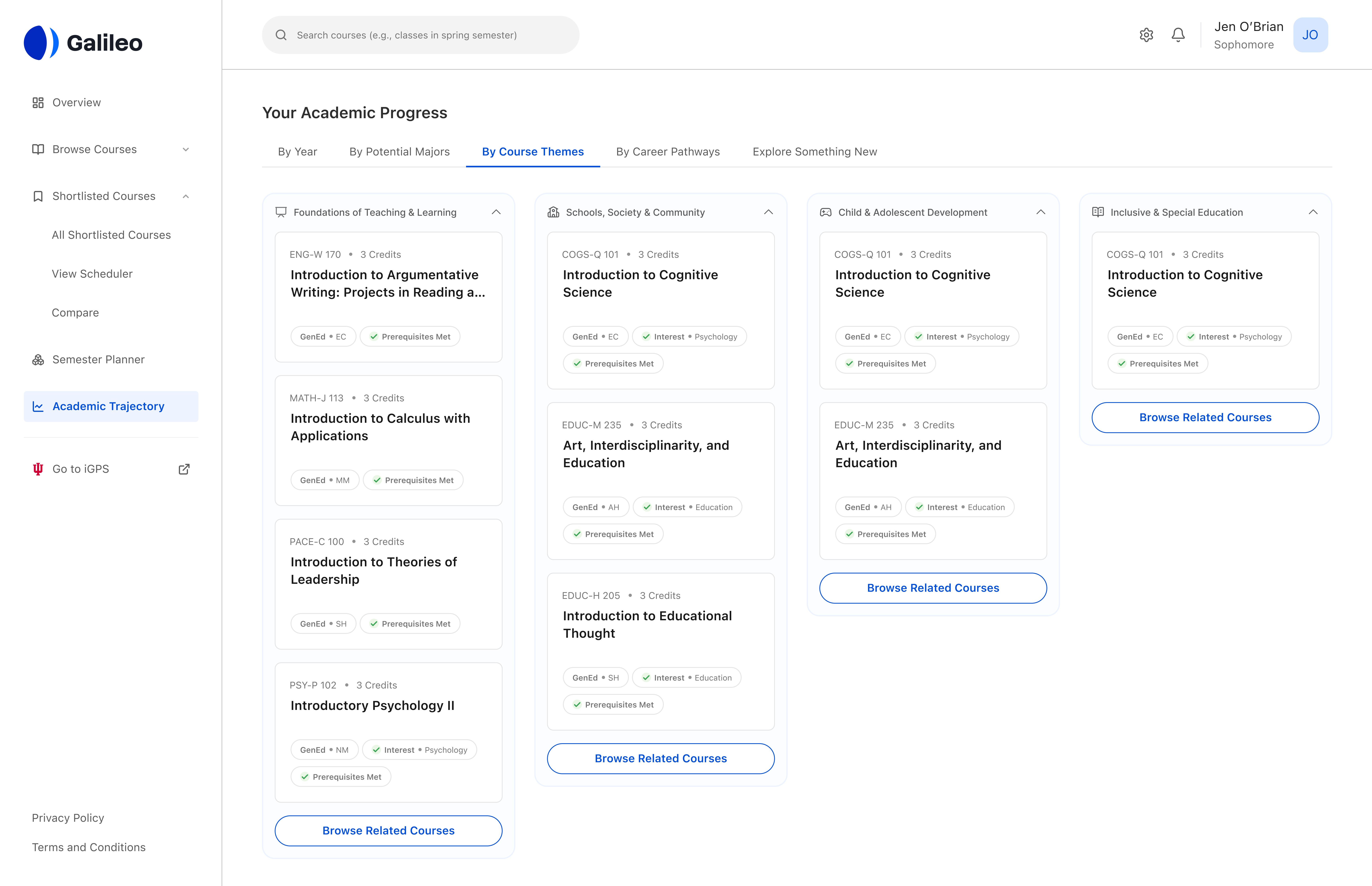
Academic Trajectory
This section is where Galileo gets reflective. It shows potential majors and careers surfaced from a student's course history and interests and lets them view their academic progress through four lenses: by year, by potential major, by course themes and by career pathways.
The same data with four different ways to connect it to something that actually matters to them. The research kept surfacing the same problem: students had too much information and lacked ways to interpret them.
The AI transparency patterns I used were drawn from Shape of AI by Emily Campbell.
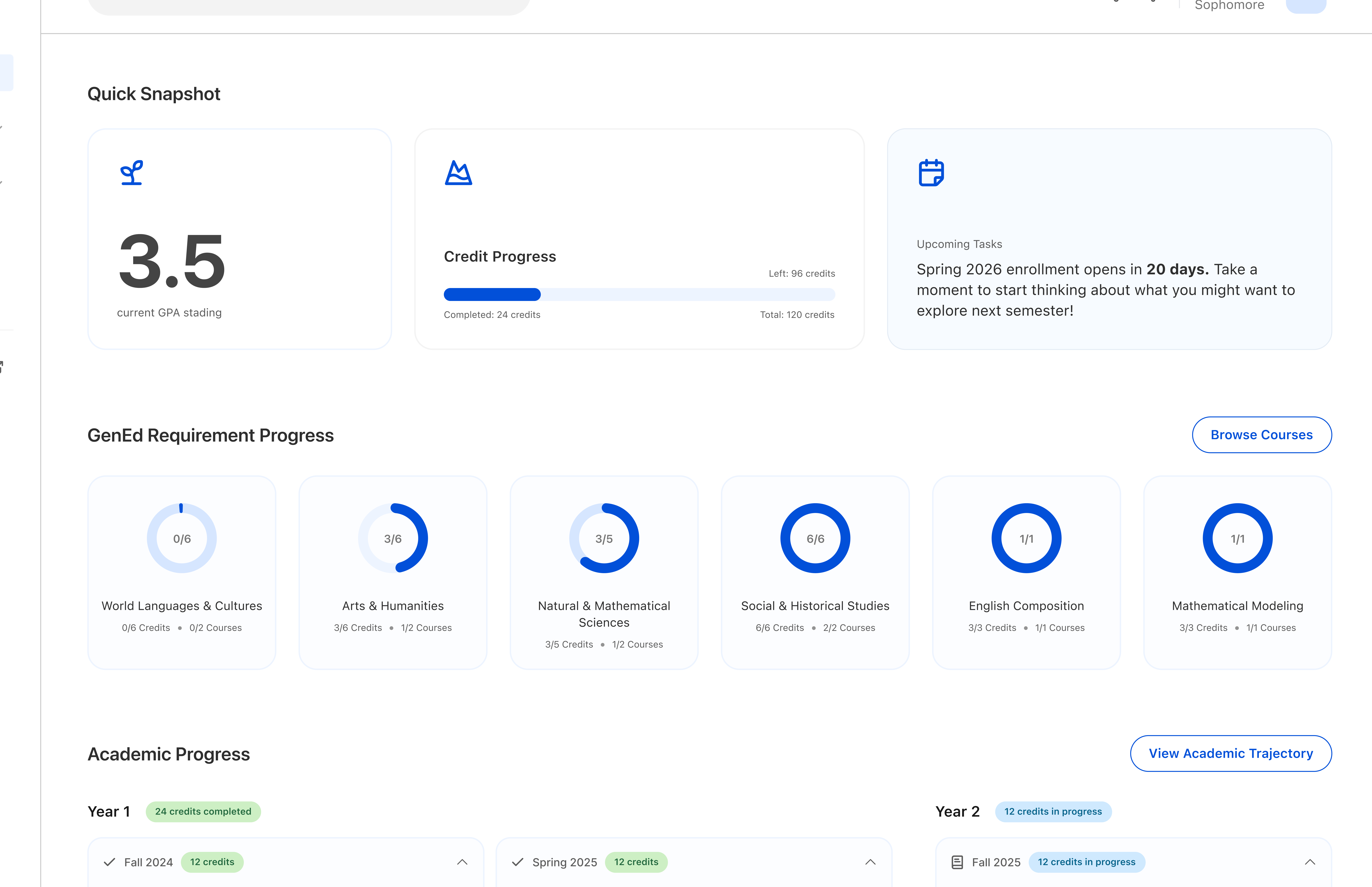
Overview Dashboard
This is the first screen a student lands on. The goal was simple: you open Galileo and immediately know where you stand and what needs your attention. GPA, GenEd progress, enrollment deadlines and a single path forward into the rest of the product.
Getting here required cutting almost everything. The first feedback from Salesforce was that there was no clear action a student could take. Early iterations had an academic compass visualization, quick links, an advisor panel and multiple CTAs. None of it made the cut. Every element that stayed had to be actionable.
The Overview section of Galileo.
The messy parts
01
The advisor question kept coming back
We designed Galileo for students navigating independently. What we didn't fully resolve was where a human advisor fits into that. Advising is already a system with people in it but Galileo doesn't account for that yet. We made a deliberate call to solve core problem areas completely rather than spread thin across everything.
02
Designing as part of a design team
7 people were building sections in parallel and my job was partly to make sure they held together as a system. Keeping visual and interaction language consistent across work I didn't directly own required a different kind of discipline. I learned when to push back on a decision that worked in isolation but quietly breaks things when you zoom out.