

Redesigned the decision logic behind Rocket Mortgage's AI assistant around each client's mortgage stage.
Handed off
Aug 2025
Industry
B2C Fintech
Role
Product Design
Team
Conversational AI Designers, Product Designers
TL;DR
Problem
The guidance was generic, right when clients needed specifics most.
Rocket Mortgage's assistant walks homebuyers through the process after their offer is accepted, but the advice didn't reflect each client's actual stage or situation.
Solution
I redesigned the experience around three moves.
Task cards during onboarding driven by their real loan stage, in-chat access to sourced recommendations personalized to their home and a transparent human handoff flow when needed.
Impact
The patterns I proposed helped shape Rocket Assist's feature roadmap.
This was an intern project, but I wanted to find opportunities for real impact. My work influenced what the team prioritized next for Rocket Assist's capabilities.
Core Flows
Turning a generic chat into a guided mortgage journey.

Context-Aware Guidance
Reads the client's real loan stage and shows only the tasks still open.

Sourced Recommendations
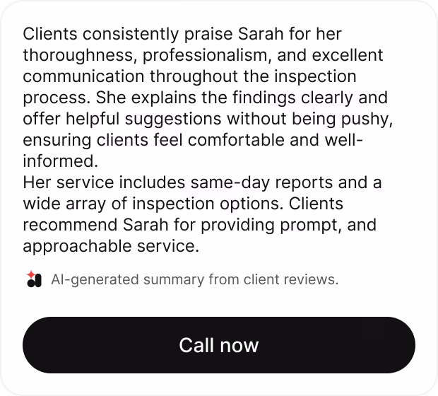
Names every recommendation's source. Realtor, appraisal report or the home's own listing data.

Transparent Handoff
Hands off before the client gets stuck. Wait time shown, no dead air.
Impact
Trust, control and explainability, validated with the clients.
Improved Experience
92%
of clients found the tailored responses were more helpful than the current guidance.
Increased Trust
75%
of clients found sourced recommendations by AI more trustworthy.
Reduced Frustration
96%
of clients flagged the transparent human handoff flow design would reduce frustration.
Testimonials
What the people who saw the work up close had to say
“This was perhaps her most complex assignment, and Pri quickly mapped key friction points while collaborating with engineers and researchers. Her work helped influence product roadmap priorities.”
Dana Lee
Director of Conversational AI Design & Digital Product Management
“Pri routinely sought out and addressed challenging issues, independently identified critical opportunities for improvement, and delivered results on par with a full-time associate designer.”
Amanda Matzenbach
Conversational AI Design Manager & Mentor
Problem
The assistant gave every client the same advice
“It's an authenticated experience so it has my data, but chat history tells me otherwise.”
The post-offer stage is one of the most delicate parts of the home-buying journey and the chat treated it like any other. Clients who had just gotten their offer accepted after months of hurdles needed a clear guide on what came next. What they got instead was the same generic advice every buyer saw, regardless of loan stage.
Generic chat experience
“I'm buying a house; it's a lot of money - it should really be a guided journey.”
When a client needed a human, the handoff flow was broken. No actionable next step came from the chat itself, just contact details to figure out on their own. This left a majority of clients frustrated which impacted Rocket Assist's credibility as a product the clients could depend on.
Broken human handoff flow
Design Approach
From research insights to identifying three design bets
01
Mapped chat logs and the research team's past client interviews
After pouring over research reports from the Research team, I consolidated everything into one affinity board which helped me identify the low and high hanging fruits.
02
Spoke to chat specialists since they were the closest to the clients
They handled these conversations daily, so I interviewed them on what clients kept asking the most and how they worked around these gaps that Rocket Assist currently had.

03
Understanding which APIs to connect to Rocket Assist
I sat with engineers to scope what data the chat could realistically use. We went through what APIs were already connected, what wasn't and what could be pulled in without a massive restructuring.
04
Pressure testing the identified opportunities of the project
I brought the affinity map to my mentor and together we narrowed dozens of pain points down to the opportunity areas with the highest stakes, which became the three pillars of the project.
Final Solution
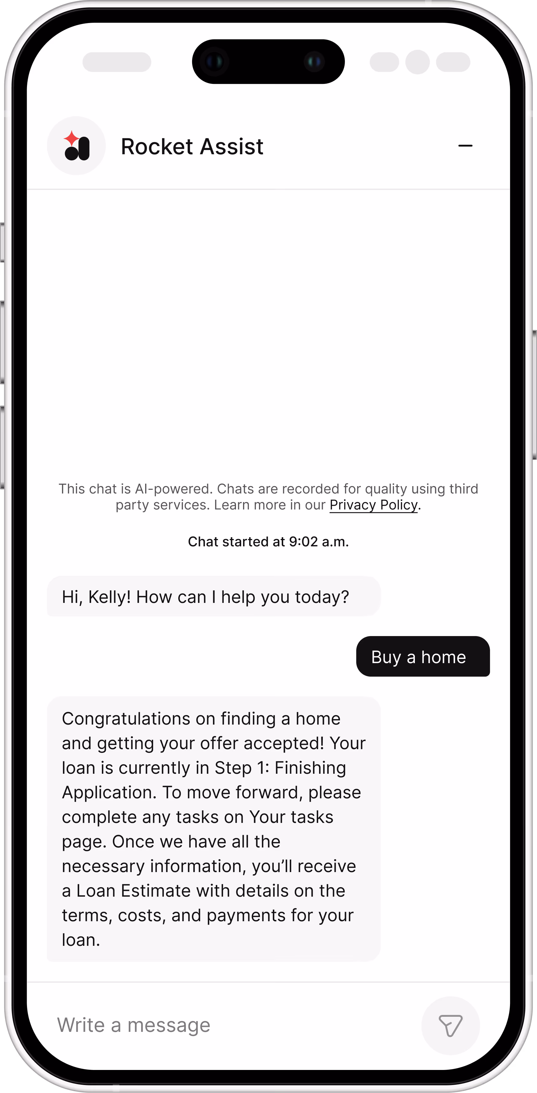
Move 1: Reading the loan stage to know what's next
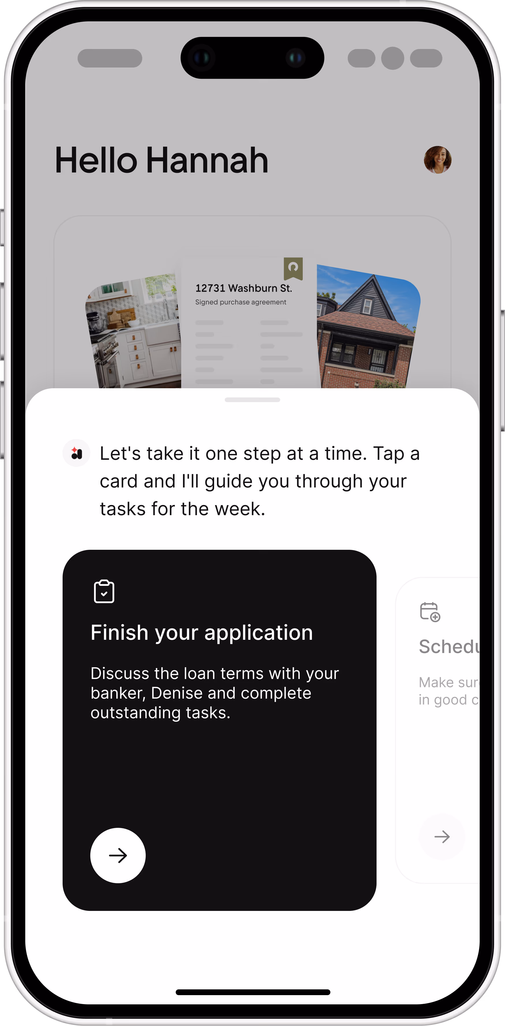
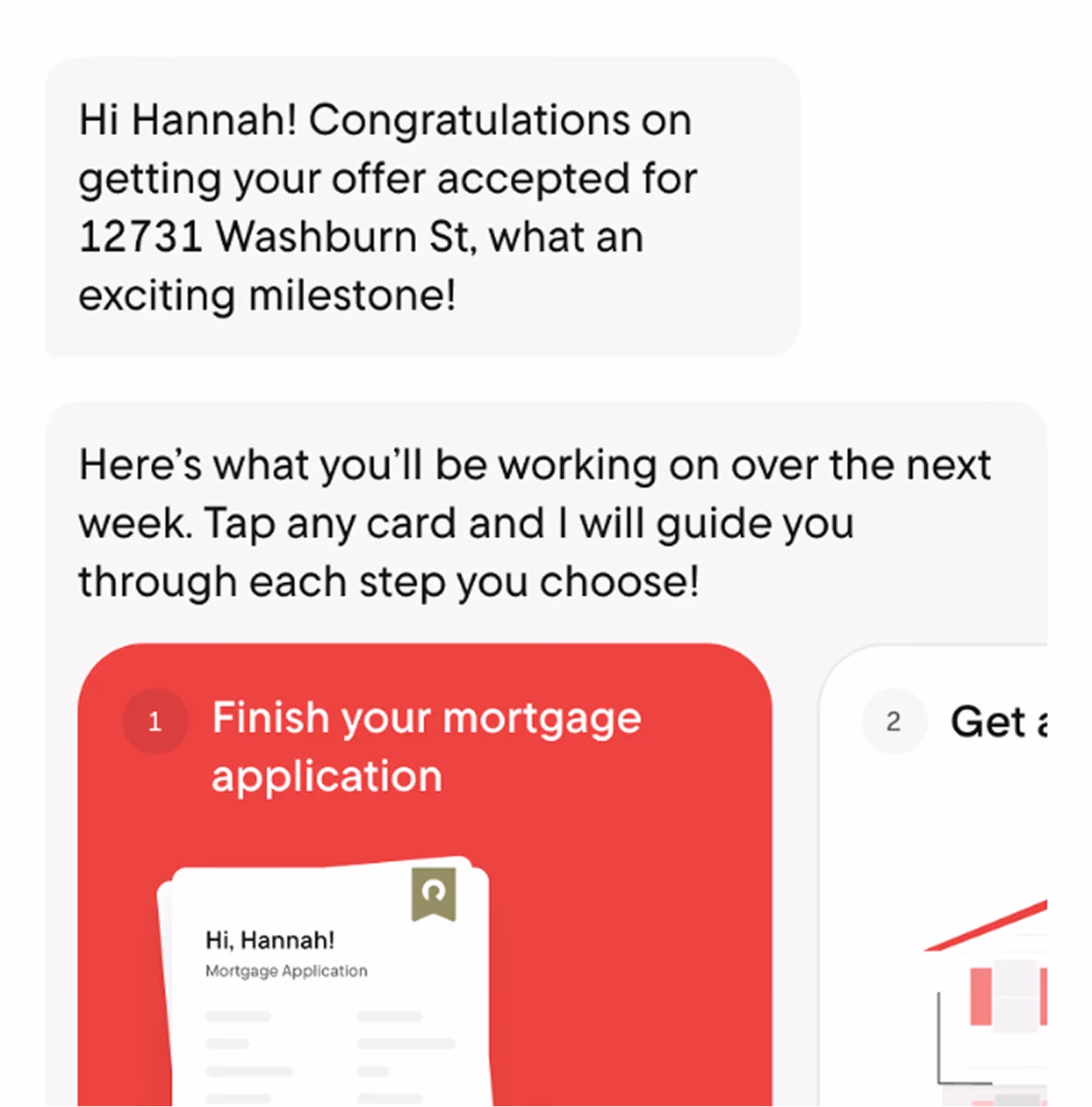
Next steps in a visual and interactive form
Task lists scoped to real progress
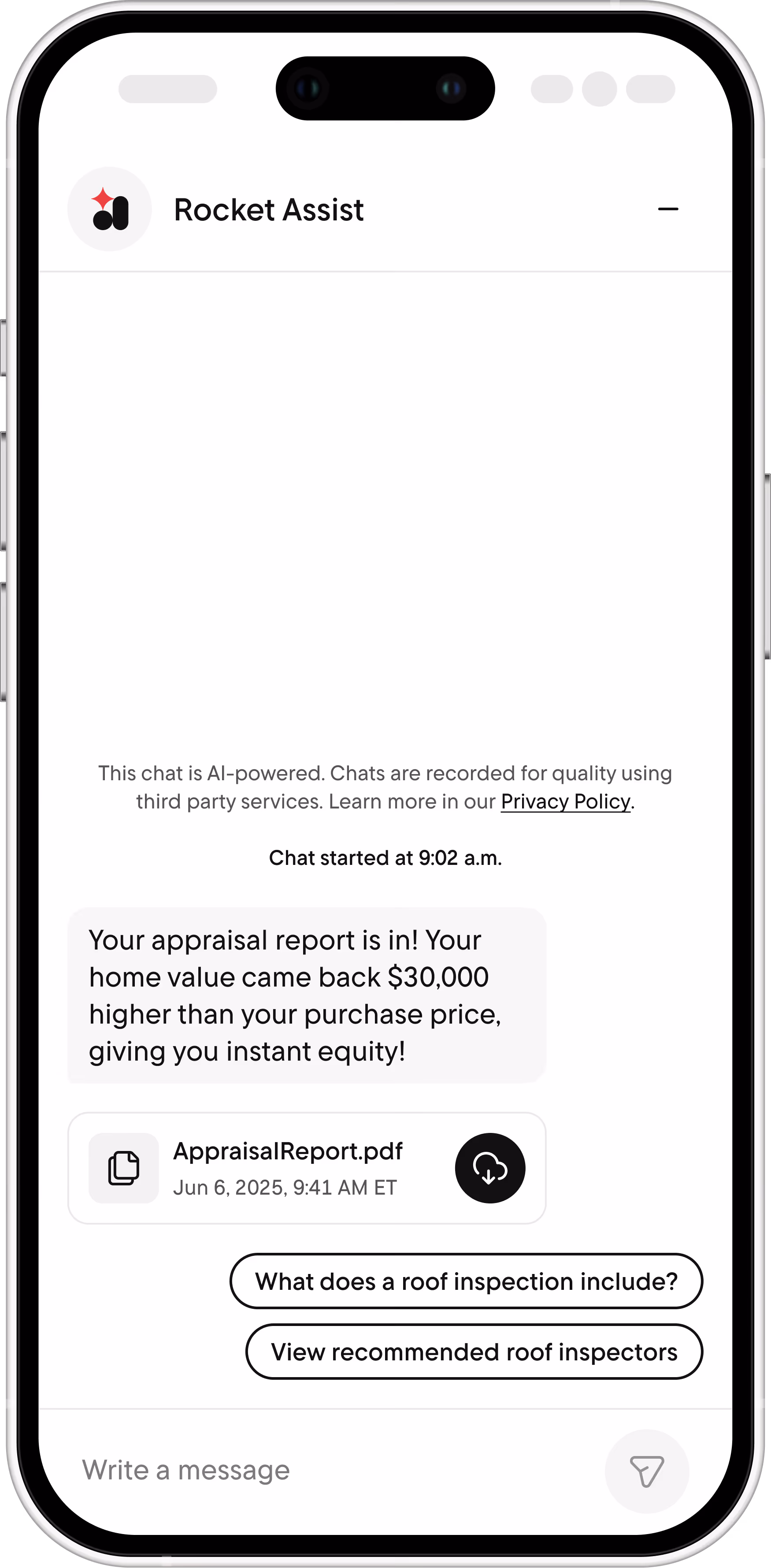
Rocket Mortgage already tracked each client against a milestone map: pre-approval letter, signed application.. The assistant read that state and showed only what was left, specific to their loan stage.
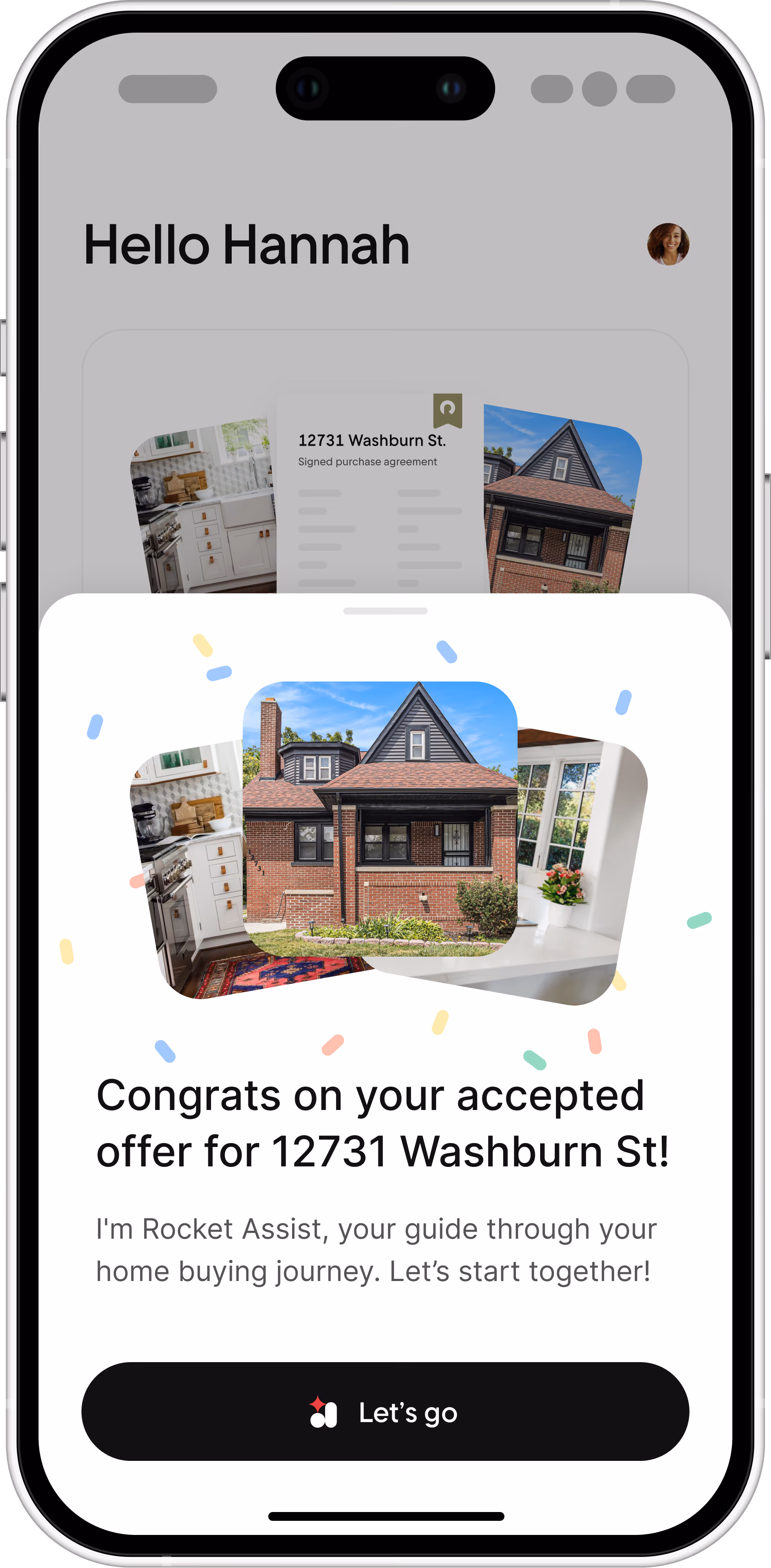
Personalized greeting with pictures of their home
Reflects the dashboard's data
In mortgage origination, the vertical I worked in, a live API fed the main dashboard each client's loan stage. Using this API meant Rocket Assist could personalize its guidance and stay consistent with what the dashboard showed.
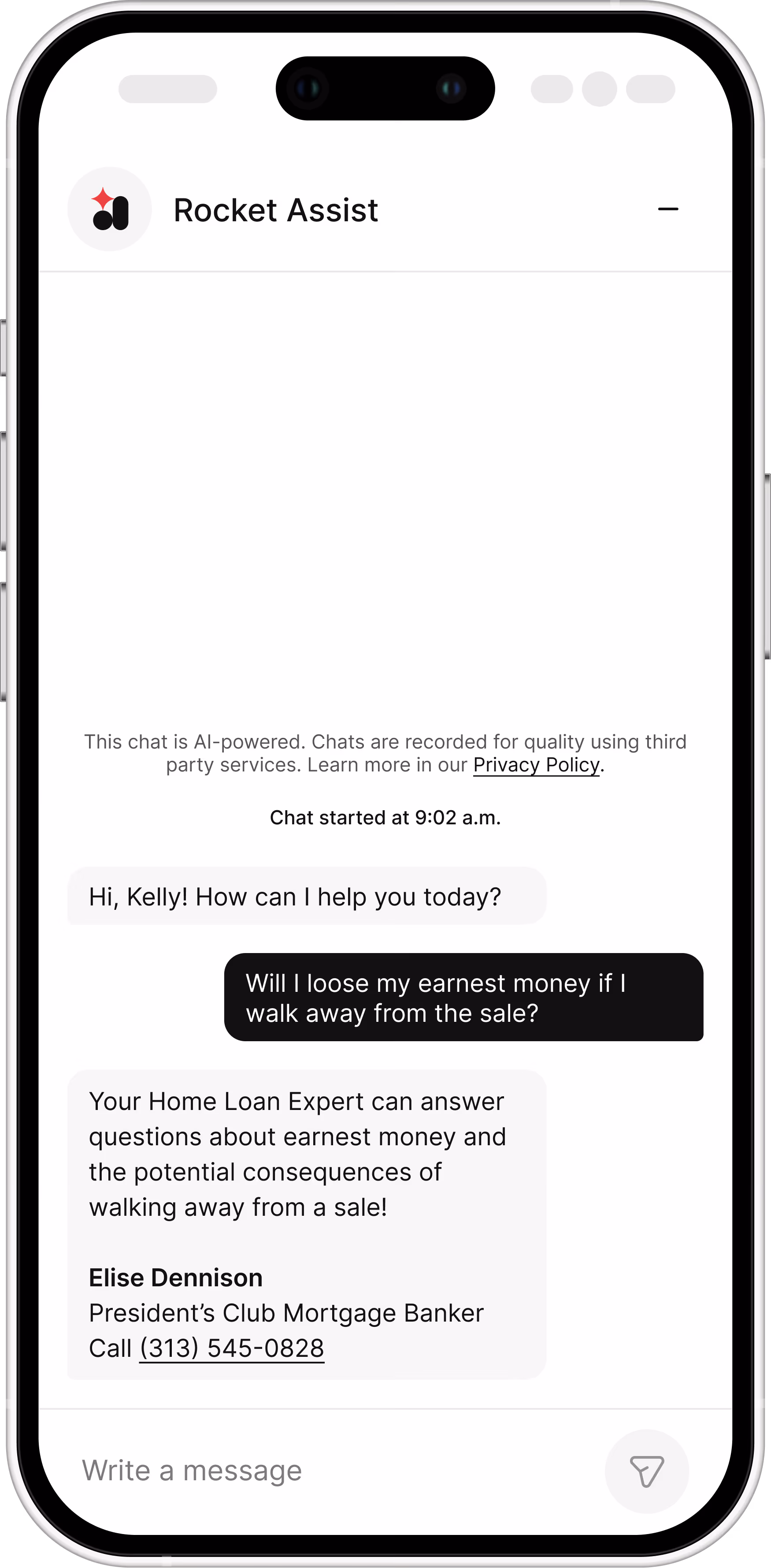
Move 2: Naming the source behind every recommendation
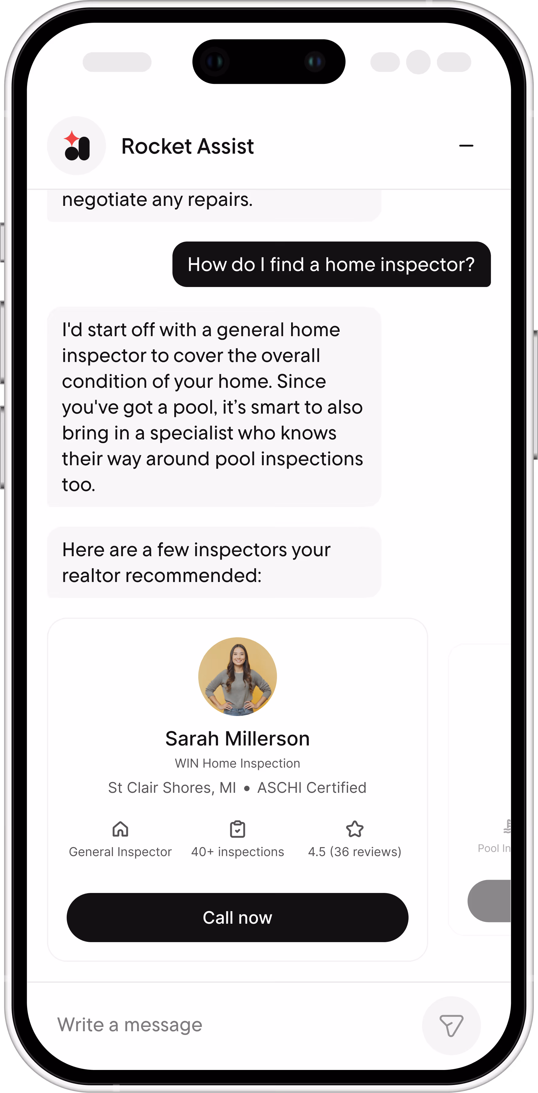
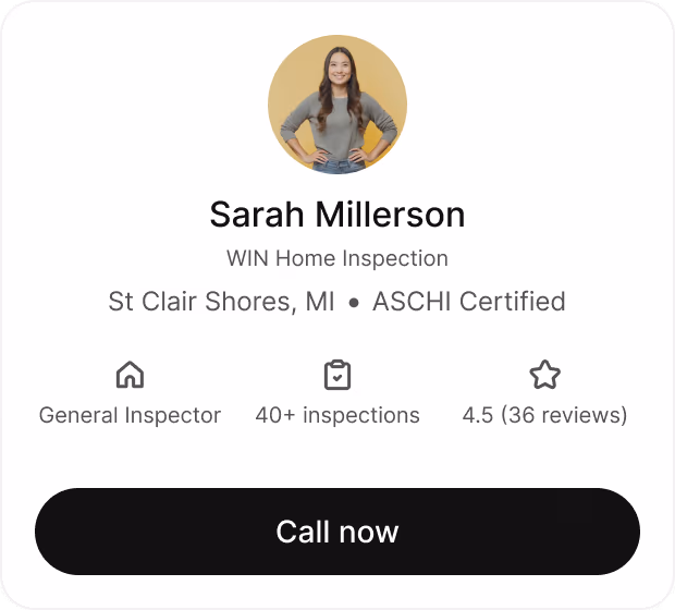
In-chat inspector contact cards
All recommendations name the source
Inspector suggestions came labeled as from the realtor, appraisal insights were tied to the report and insurance tips pointed back to the home's own Redfin listing.
Important documents accessible within chat
Relevant files are one tap away
Reports could be downloaded straight from the chat by name and file type, so clients didn't need to open a second interface to check the paperwork.
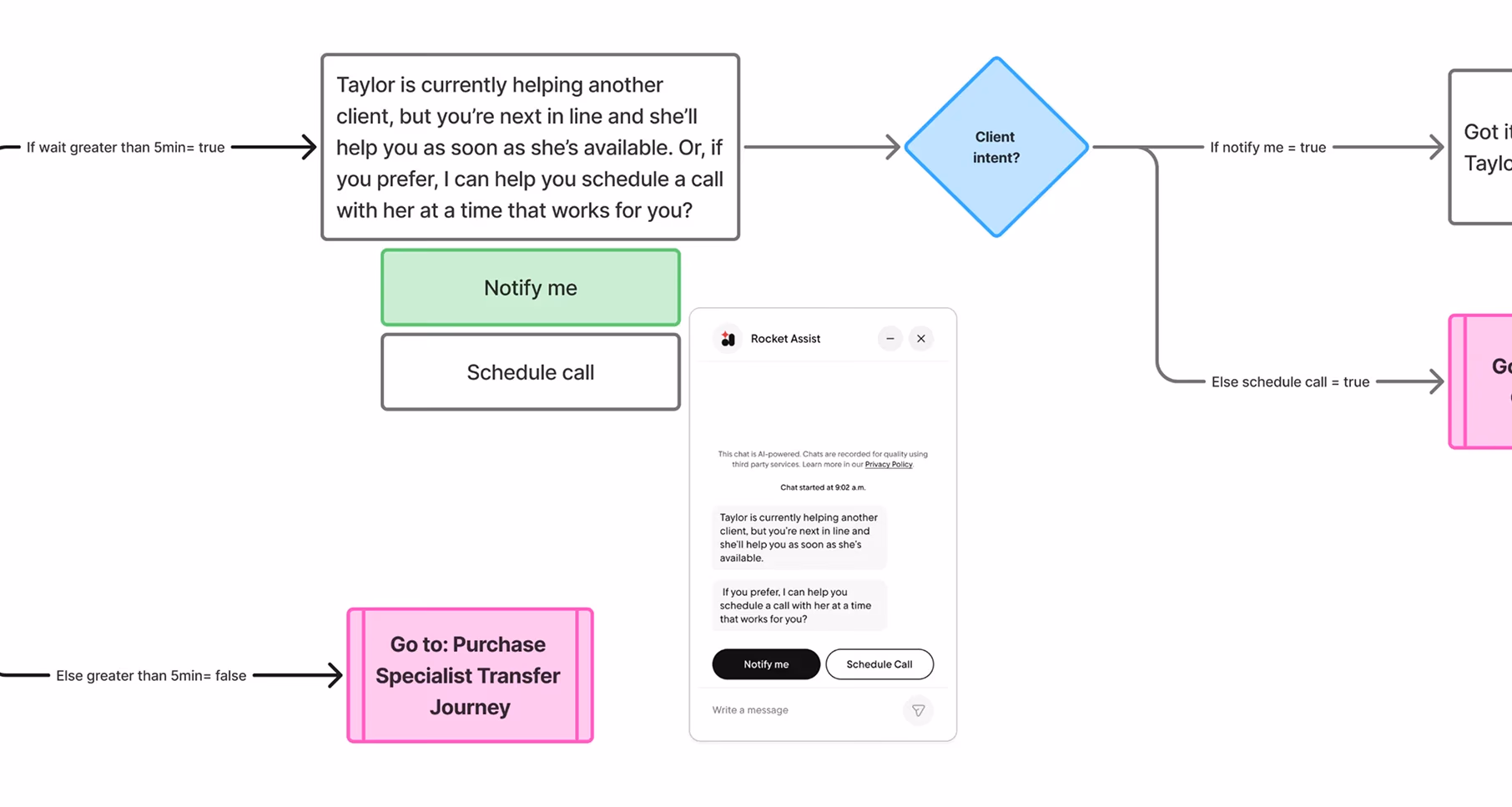
Move 3: Transparent & smooth AI-Human handoff flow
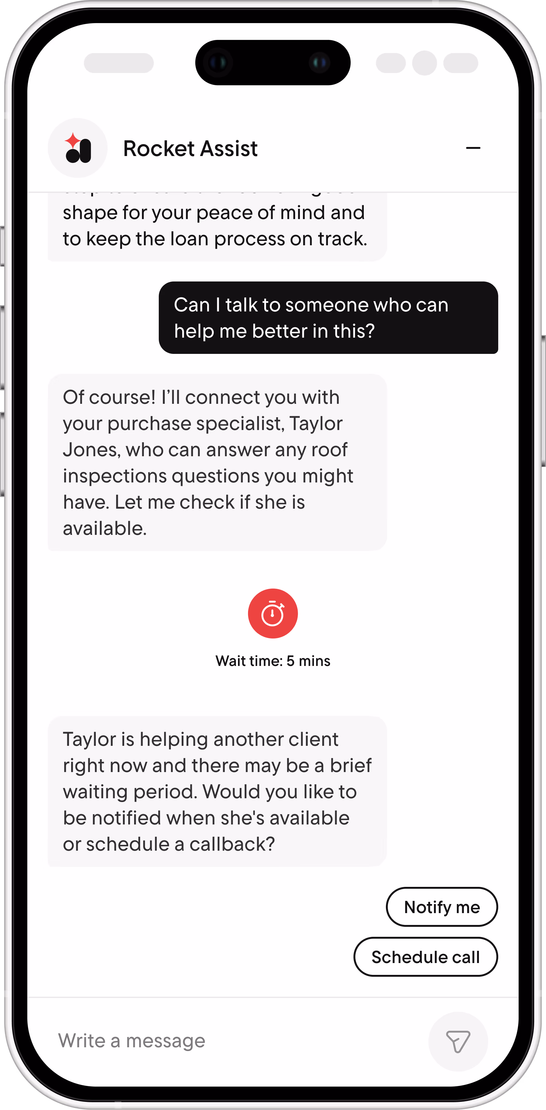
Clear communication on agent availability
Handoff as its own flow
Specific signals triggered it automatically: a client asking if anyone could help, or clear frustration in their messages, routed straight to their purchase specialist.
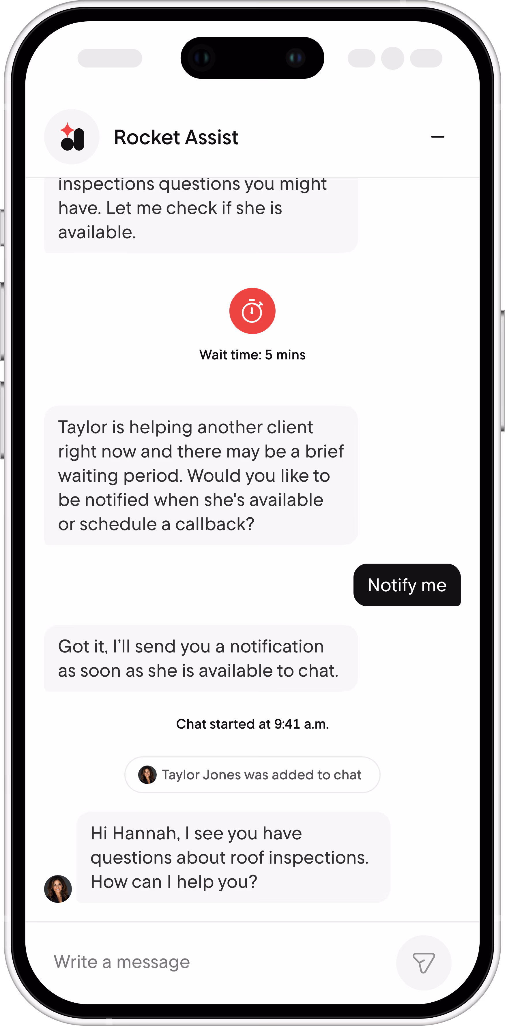
Context retention with human handover
Context retention
The conversation history carried over so the specialist could pick up exactly where the AI left off. This saves the client having to walk through their problem again.
Blockers
The inspector card feature tested well but got cut
It scored high in usability testing, but the backend architecture needed to support it wasn't within the team's bandwidth that cycle. Building it would require multiple API integrations, not just within the Rocket Mortgage system but also Redfin's which has been acquired by Rocket Companies. It was an essential lesson between the simplicity of a feature design and the many pieces that had to fall into place in order to push it out the door.
Front
Back
In Hindsight
What I'd design differently
01
No fallback path existed for a mismatched task
Rocket Assist reflected the dashboard's state rather than owning it, so a correction path belonged to that system, not this surface.
02
No way for a client to directly correct the assistant
Frustration-based triggers caught some of that gap by routing to a human, but a direct "this is wrong" flow stayed out of scope.
Reflections
What I'd take into the next project
Every feature is ten decisions that have to align first.
Watching a PM break the work down into APIs, infrastructure constraints and engineering dependencies changed what “design” meant to me in a mature org.
Collaboration as a design tool
Seeking out engineers, researchers and SMEs before being asked is what got me into the conversations that shaped the work most and helped me identify edge cases.