
Helping internal teams find where enterprise agents break and cutting down manual work by 70%.
Shipped
Oct 2022
Industry
B2B SaaS
Role
Product Designer
Team
CS Team, CTO, CEO, Developers
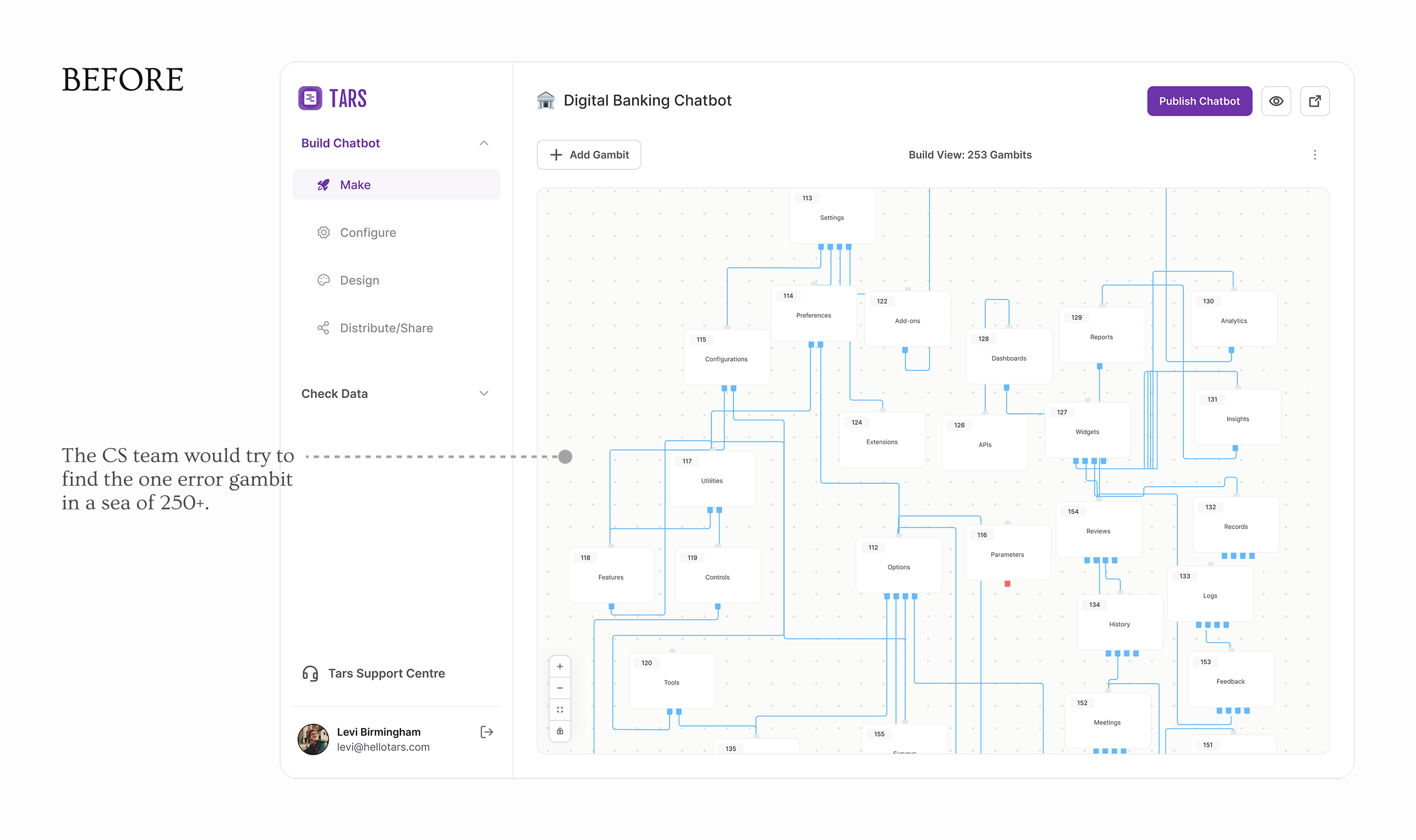
Tars is a B2B platform where enterprise AI agents are built as visual flowcharts. Each node is a single conversational turn called a gambit. An enterprise banking chatbot could have 500 of them, and when something breaks in a workflow that size, finding it manually means scrolling through hundreds of nodes and starting over.
I designed and shipped Debug Mode, an automated end-to-end test runner that highlights the active gambit, auto-scrolls the canvas, and stops the moment something breaks. I designed for two user types with fundamentally different technical backgrounds.
Shipped (full-release)
1 month
Troubleshooting time cut by
~70%
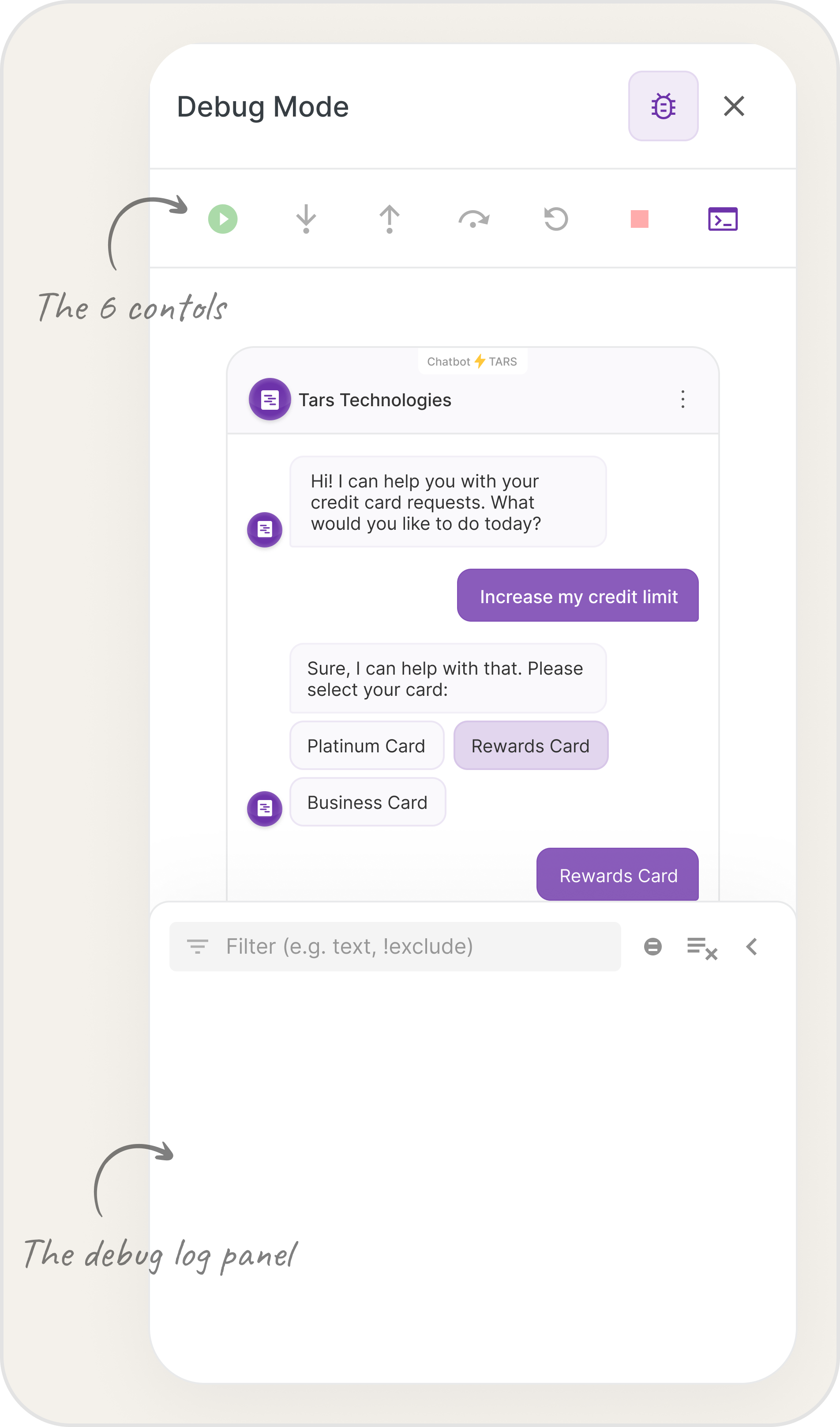
The shipped ‘Debug Mode’ feature, introduced to reduce testing time by the internal team and clients.
Background
500 gambits, one broken path, no way to find it.
During one of the product team standups, the CTO flagged a pain point. The CS team was spending hours debugging chatbots, often getting stuck trying to identify a broken gambit in a 500+ gambit canvas.
When I observed their workflow directly, I saw the real problem was mechanical. They'd manually step through the chatbot flow, lose track of where they were, scroll back to the beginning and then start over. The process was draining and error-prone.
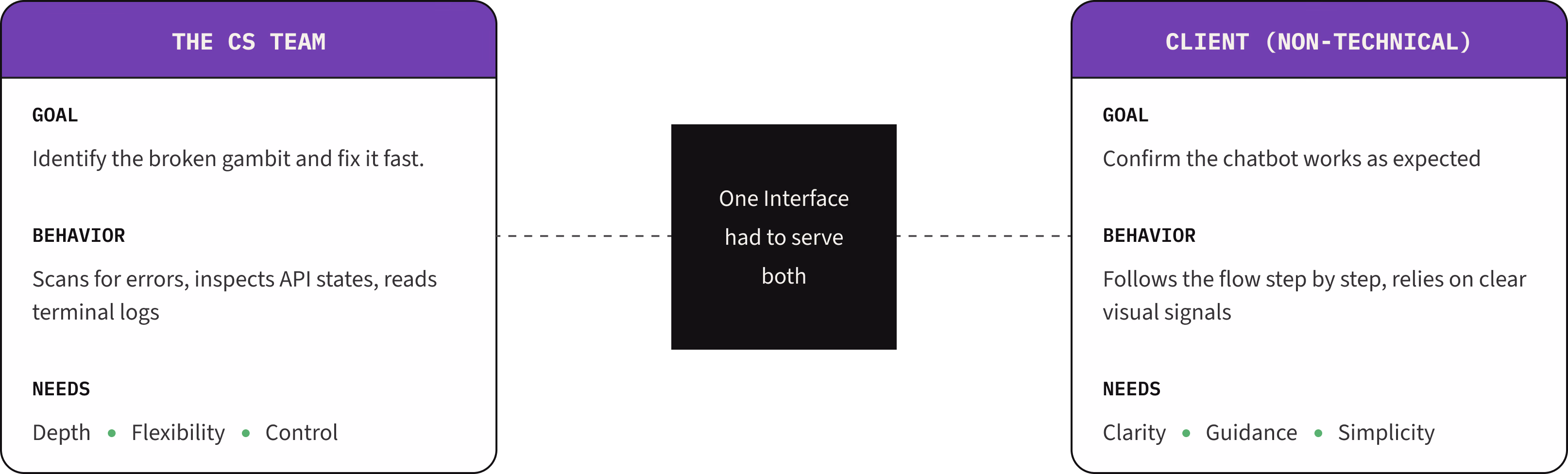
The constraint that emerged was non-negotiable. I needed to design one interface that could work for the CS team (who could read API errors and JSON) while also eventually scaling to clients with no technical background. Two completely different mental models supported by one feature.
Design Decision 01
The canvas was overwhelming with three different visual signals. One was enough.
Iteration 1, Color-coded states
The first version used colors, yellow for active, green for passed and red for error. This was logical on paper but the problem showed up on a real canvas. 500 gambits, some overlapping, now covered in green and yellow and red on top of the existing blue. The color system was asking the canvas to communicate three things at once when the user only needed one: where is the debugger right now?
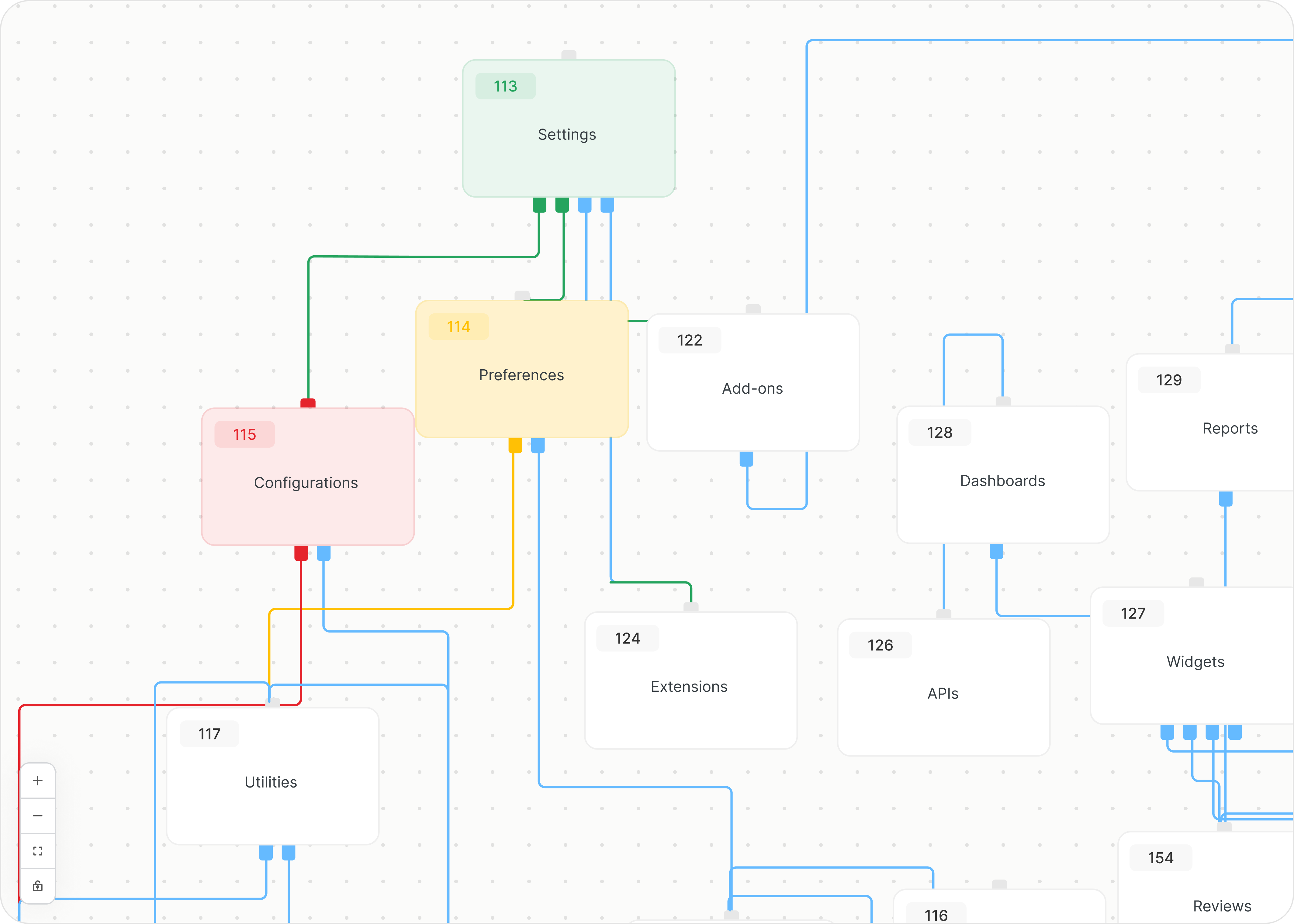
My initial design of color-coding the gambits based on their debugging state.
Iteration 2, Single color, dashed lines and a glow
One signal. That's all users needed. I simplified to one. I stuck to the default blue and instead used opacity levels to denote change. The active gambit got a subtle blue glow on top of the opacity change. Dashed connector lines showed the path the debugger was taking, so users could see which branch the conversation would follow before it got there.
Active state
100% opacity + subtle blue glow
Inactive state
40% opacity, no color change
Path signal
Dashed and moving connector lines
Navigation
Auto-zoom follows active gambit
The original design required users to pan through the flow to understand test health. I refined the design to surface this immediately. Pills at the top surfaced total gambits tested and error count in one glance, shifting the mental model from ‘navigate the flow to find problems’ to ‘confirm status, then drill in.’
Design Decision 02
The CS team understood the terminal. The step controls stopped them.
With the canvas resolved, I turned to the control panel. I modeled the first version on IDE debugger interfaces, the environment the CS team was most likely familiar with. Six controls: play/pause, stop, step into, step out, step over and see logs.
The CS team understood the terminal immediately. Step into, step out and step over stopped them. If they were pausing on those controls, a client with no development background would be lost.
A roadmap conversation happening at the same time made the answer clear. An SMB client managing their own chatbot and an enterprise client with a dedicated engineering team needed different things from this tool. The advanced controls weren't wrong, they were intended for a different release.
Iteration 2, Shipping a simpler version was the right call
I stripped the design to three controls: play/pause, stop, restart. Status messages, debugging in progress, paused, stopped, removed any ambiguity about what was happening without requiring the user to understand the canvas.
Reflection
The right answer and the complete answer aren't always the same thing.
Within a couple of months of releasing the simplified design, we found that 90% of errors were easily resolved by making a minor change in the gambit controls, or were caused by API connections and custom code issues. The advanced controls and debug log were nice to think about in terms of feature sophistication, but wouldn't have been needed in the long-term.
As a designer, you really have to account for what is actually needed. It is easy to get carried away and add more to a design but sometimes, Occam's razor is the right answer.